
TAKE A LOOK | MTN unveils new logo
MTN has changed its logo as part of a revamped brand identity, the company announced on Wednesday.
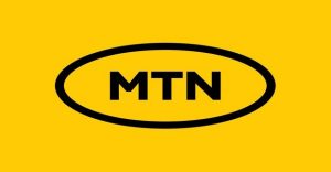
The new logo still features the iconic yellow colour, but the oval-shaped blue background with a red accent has been dropped. Instead, the stripped-down logo now has MTN in black lettering – still framed in an oval shape.
The company said in a statement the refreshed brand identity would be revealed on 27 February.
It said that the new logo aligns with its so-called “Ambition 2025”, which involves its evolution into a technology firm, and developing its fintech and digital services platform.
Ultimately, this will see the company split into different separate businesses, including one focused on its infrastructure assets.
The operator, which was founded in 1994, has over the years made great inroads on the African continent – especially Nigeria, its largest market outside South Africa.

It is currently exiting the Middle East to focus on African markets is currently underway, and the company has already left war-torn Syria and Yemen.